
Flatiron Health — Illustration System

Hero Illustration: Who We Are
Flatiron Health's illustrations convey complexity, enhancing its brand identity and communication strategy.
Challenge
A new look and feel illustration style that can be repeated and reusable, a system-based approach — creating a broad set of reusable components that make up an “illustration library” which Flatiron Brand Team can use to create new illustrations with a quick turnaround.
Role: Design Thinking, Strategy, Art Direction, Illustration, Iconography, Brand XP
Approach
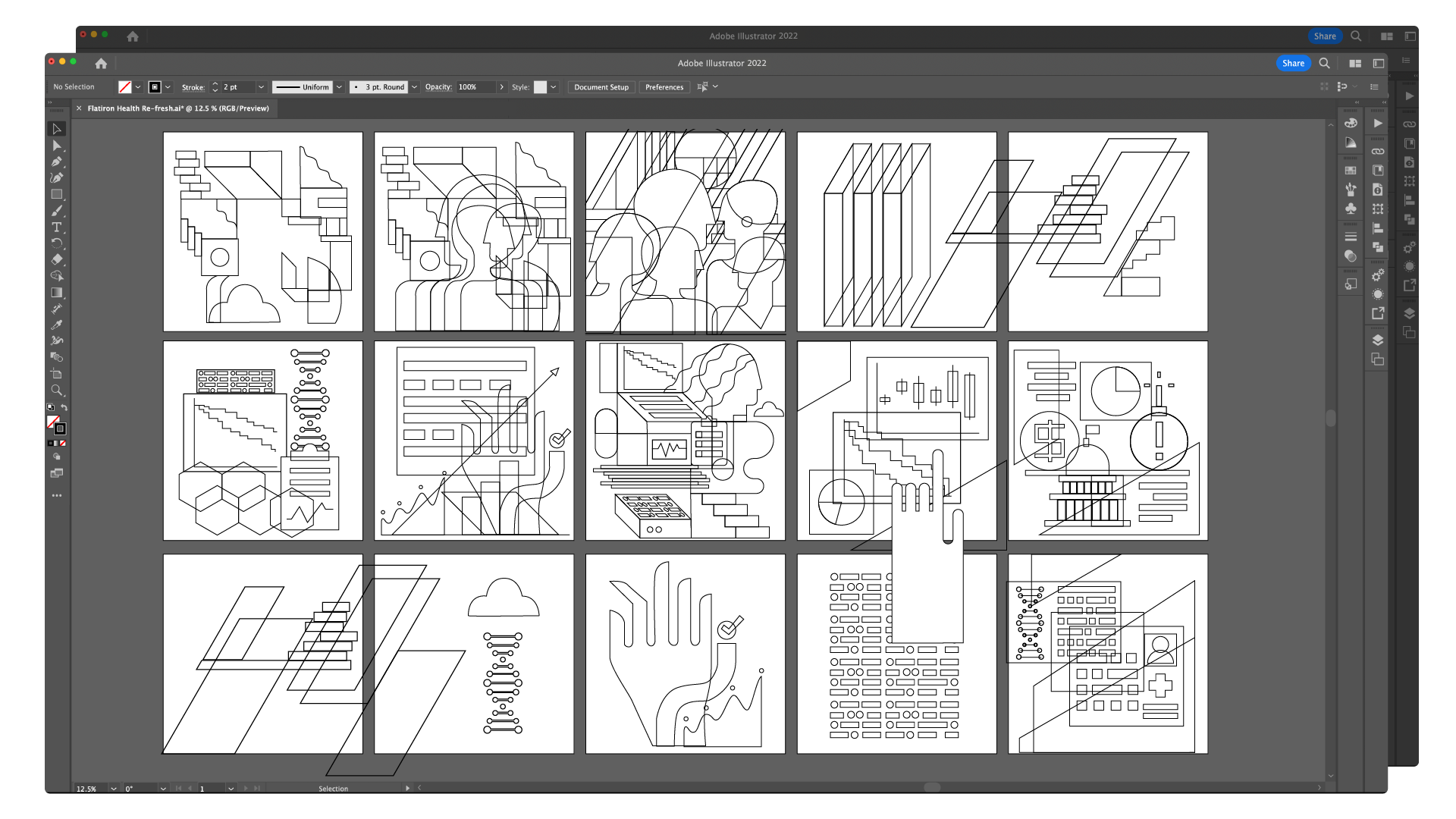
Flatiron Health's Refreshed Illustrations were vibrant visual aids that conveyed complexity and captured attention while reinforcing the company's brand identity with sophisticated design. Precise linear details combined with unexpected color palettes created visuals that stood out and enriched the editorial content. Each illustration was meticulously crafted to resonate with its audience and uphold Flatiron's commitment to innovation in healthcare.
The entire illustration refresh began with the editorial hero image, color, and iconography components. Then, it expanded into a whole set of editorial images — one of Flatiron's primary communication sources. A set of illustration systems included a variety of iconography elements.
Conceptualization
Understand the message and audience to prioritize editorial comprehension.
Identify key themes or complex topics to visualize, focusing on elements that are challenging to represent conventionally.
Design Iterations
Begin with rough sketches to explore various visual concepts and compositions.
😎😎😎😎 These are some sketches that show the early stages of my ideas and development.
Refine selected concepts, emphasizing precise linear details and adherence to the brand's color palette.

Experiment with the balance between curved and geometric shapes, ensuring a harmonious blend that exudes sophistication.


⚡️⚡️⚡️⚡️ During the initial stages of creating hero illustrations, various colors and shapes were explored.
Final Digital Rendering
Color Palette
Utilize 2-5 swatches from Flatiron Health's global color palette, focusing on vibrant, unexpected, minimal, and mature tones.
Introduce tone-on-tone dark and light shades of chosen colors to add depth and dimension.
Incorporate white details strategically to create modern contrast and enhance visual appeal.
Precise Linear Details
Infuse illustrations with small, thoughtful, and custom linear details.
Employ outlined shapes, small line accents, and geometric elements to balance blockiness and instill sophistication.
Aim for a blend of curved and geometric shapes, prioritizing sharp and angular overall aesthetics.
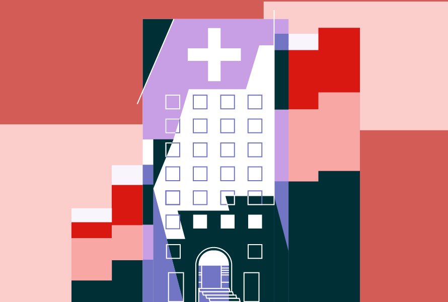
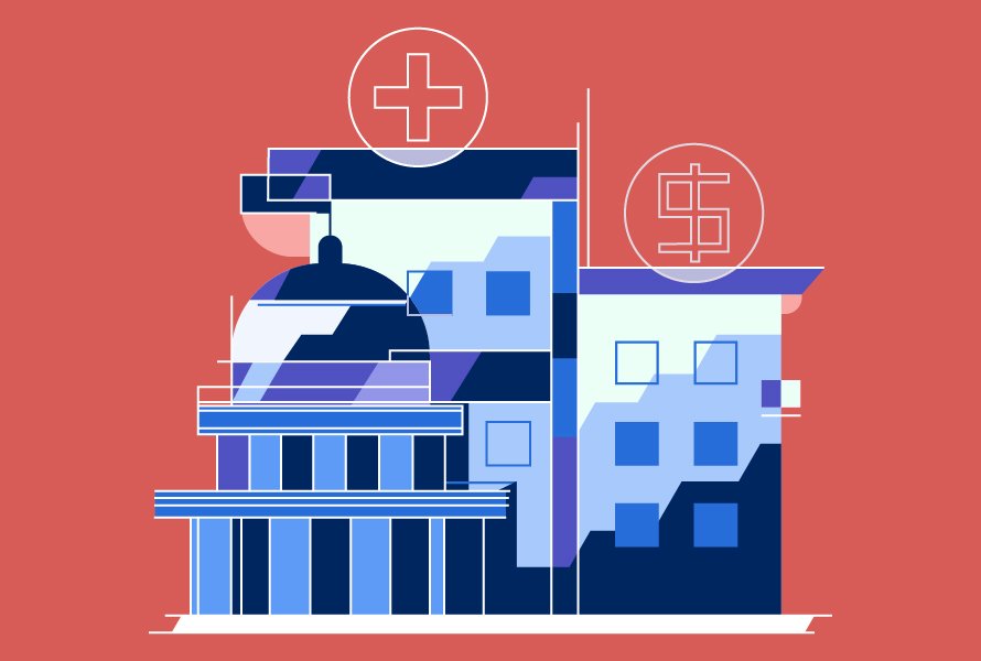
Hero Illustrations


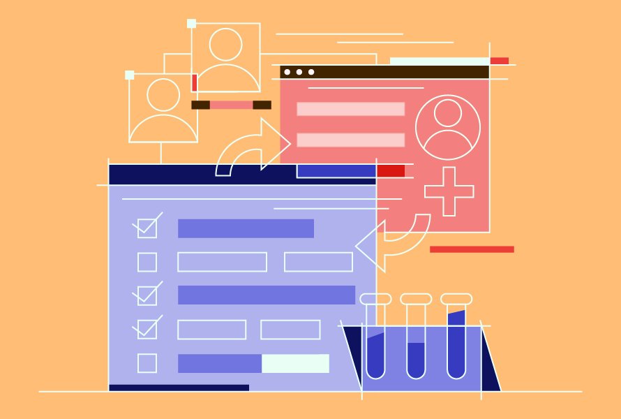

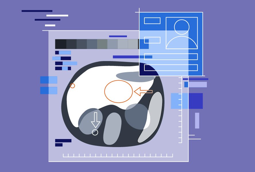

Spot Illustrations

People Components

Technology Components
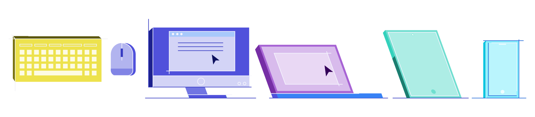
Device Components

Medical Components

Credits:
Client: Flatiron Health
Creative + Art Direction: I-Nu Yeh
Chief Design & Marketing Officer: Jaime Lopez
Brand Lead: Martina Ackermann